A preview of the scheduling flow of Peter Welch's Gym's mobile redesign.

Introduction

How I Incorporated Rounds of Usability Testing to Improve the Booking Experience of a Local Boxing Gym

A 4-minute story of how I made it easier to book a boxing class at Peter Welch's Gym.
Role
Sole Product Designer
Relevant Skills
Usability Studies | Low-Fidelity Prototyping | Hi-Fidelity Mockups
Timeline
3 months
Project Type
Product Design | Mobile-Responsive Website

Setting the Stage

The Problem

Imagine you are excited to book your first class at a popular boxing gym.
You open the website on your phone, and groan.
What does Fighter Conditioning even mean? 
Why do I have to commit to a 10-class pass right now?
Why is everything so awkwardly spaced?
You exit the website for now, tabling this task for later.
Image of a man covering his face in frustration

The Goal

Redesign the website to make the booking process more informative, less frustrating, and more accessible on mobile.

Understanding the User

Who Are Our Users?

Boxing attracts people from a wide variety of backgrounds.
Our users are usually between 20 and 55 years old, have varying levels of physical fitness, and varying levels of boxing experience.
Despite the range, one thing ties them all together:
Most users visit the website with the intent to schedule a class at the gym.
Image of a button that says Book a Class Today
Another thing is true:
Frustrated users will abandon the booking process.
Image of a person screaming in frustration.

Why Are Users Frustrated?

I used direct observation on four study participants to figure out the biggest pain points in the booking process.
"I wish I could see some class details so I know what I'm even signing up for."
Pain Point #1: Obscured Information
The booking process does not surface any class details, forcing users to abandon the booking process and scour the website in order to learn what a class will cover.
Three screens of the original checkout process that does not show any class details.
User must exit booking flow to find details about a class.
"Having to scroll so much and zoom to read text is pretty annoying."
Pain Point #2: Poor Mobile Accessibility
Cluttered or awkwardly spaced mobile websites cause users to feel fatigued when booking a class. Users have to scroll excessively to see what's on the page or strain to read text that is too small.
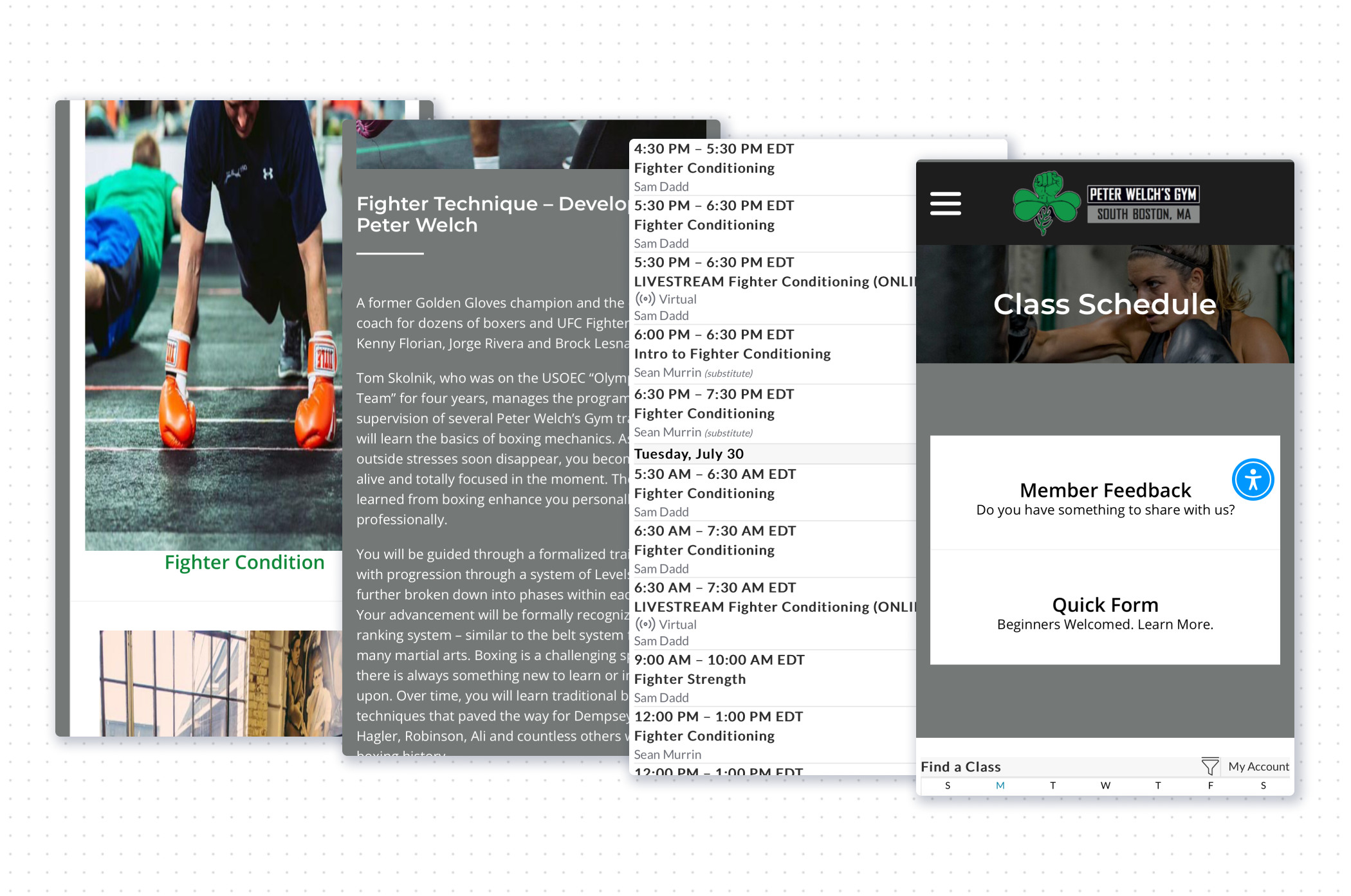
Four screenshots of the original Peter Welch's Gym website with too-small text and too-large and distorted images.
Spacing is sometimes too large and text is sometimes too small.
"Ugh, I don't want to spend $250 on a multi-class pass right now."
Pain Point #3: Premature Paywall
Users experience shock and irritation when trying to book a singular class and being prompted to purchase a much more expensive 10-Class pass.
Three screenshots of the original website's scheduling process, in which the default option for payment is the $250 punch card.
User is prompted to buy a 10-Class Punch Card.

Iteration 1 - Wireframes

Addressing the Pain Points

I used wireflows and user journey mapping to understand where I could shorten the booking experience and how pain points might be improved.
I addressed Pain Point #2, poor mobile accessibility, by keeping the Gestalt Principles of similarity, proximity, and common region in mind throughout the process of designing the wireframes.
Digital wireframes of the class scheduling experience with class details.
I improved Pain Point #1, obscured information, by adding a class overview section with information about the class.
This is displayed after the user has selected a class to book.
My solution for Pain Point #3, premature paywall, was to add a dropdown field to the booking page that is set to Drop-In by default.
The user may select other pass or membership options if they wish.
Wireframes showing improved payment page that defaults to Drop-In classes and gives an option to select passes or memberships.

Testing the Low-Fi Prototype

What Did We Learn from the Usability Study?

I had 5 participants partake in an unmoderated, remote usability study in which they were tasked to book a class through the mobile website.
They helped me uncover a few critical issues:
"But what if I already have a class pass?"
Issue #1: No Way to Apply a Class Pass
The prototype does not enable the user to apply a previously purchased class pass to an order.
Users can only pay for a drop-in or purchase a multi-class pass, which is a big problem.
Wireframes of the class purchase type dropdown.
"Swiping horizontally to see upcoming class feels odd."
Issue #2: Upcoming Classes Section is Inefficient
Users complained about the horizontal scroll of the Upcoming Classes section feeling strange and cumbersome.
The preview images also take up an unnecessary amount of space, given how few classes can be displayed on the screen already.
Wireframe of the upcoming classes section.
"Will I get a confirmation email? A receipt?"
Issue #3: Post-Booking Experience is Lacking
Users expected to have some sort of confirmation sent to their emails, and some voiced a desire for a button to add the class to their personal calendar.
Wireframes of the class confirmation page.

Iteration 2 - Mockups

How Might We Improve After the Usability Study?

Rapid sketching and a comparative analysis of other products helped me brainstorm solutions for the new issues raised during the usability study.
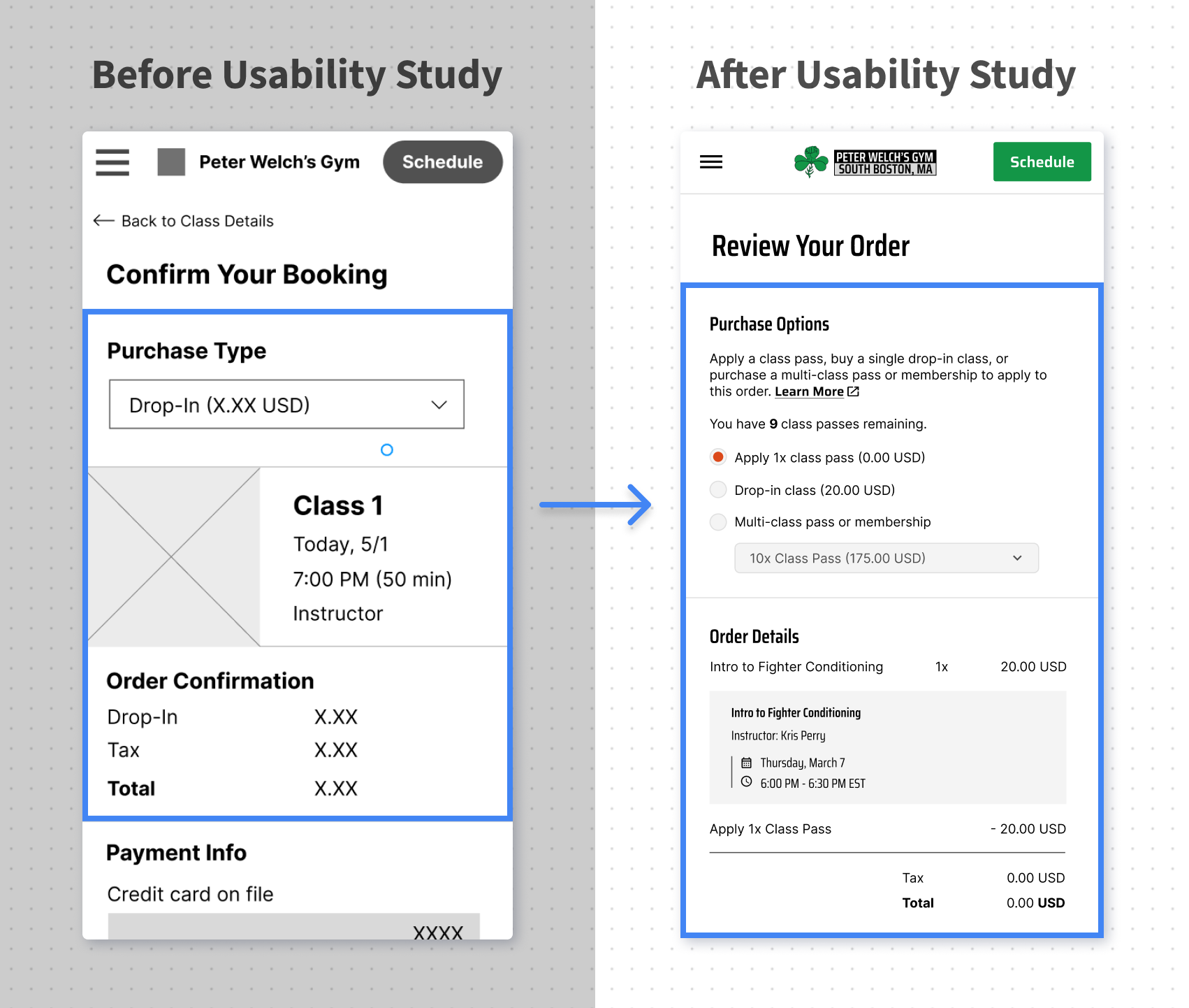
Before and after usability study feedback, showing an option to select a drop in or memberships and passes.
Purchase Flow Improvements:
1) Users can now apply a previously purchased class pass to an order
2) Users are now shown how many class passes they own
3) Users are no longer immediately prompted to purchase an expensive class pass
4) Description provides more information about passes and memberships
Before and after usability study feedback, showing an improved daily scheduler.
Home Page Scheduler Improvements:
1) More efficient space usage, shows more classes and only the necessary information
2) Scheduler now uses vertical scrolling, which is usually preferable to horizontal scrolling or tapping
3) Today’s date is shown at the top, which is more descriptive than “Upcoming Classes”
4) Arrows now allow for users to toggle to the next day to see available classes
Before and after usability study feedback, showing improved confirmation page with the add to calendar option and the share link.
Post-Booking Improvements:
1) Users are notified that a receipt and confirmation will be sent to their email
2) Users can now easily add the class to their personal calendar
3) Users can now easily share the class details with others through link or social media
4) Users are now reminded of what to bring to class after booking is completed

The Final Look - Prototype

The Improved Booking Experience

This is what it looks like to book a class through the redesigned mobile website.
[Open the Video in Youtube]
Mockups of the improved booking process.

Going Forward

Impact

I asked the four participants who tested the original booking process to try the final prototype:
1) 100% of participants completed the task of booking a class successfully
2) Participants rated their Overall Satisfaction with the redesign 5 out of 5 stars
3) Participants rated their satisfaction with the visual design 5 out of 5 stars
4) Participants rated their satisfaction with the clarity of information 5 out of 5 stars
Survey responses showing 5 stars for overall satisfaction, 4.5 ease of use, 5 visual design, 5 clarity of information, 4.5 mobile accessibility. The responses before the redesign show that overall satisfaction was 3 stars, ease of use 3 stars, visual designs 1.5 stars, clarity of information 2.5 stars, mobile accessibility 3 stars.

Takeaways

1) Usability testing on even low-fidelity prototypes can uncover critical design flaws before high-fidelity mockups are completed, saving lots of design time.
2) Observing how people interact with a product can reveal crucial insights. Individuals often interpret the same product features in very different ways.

Thank you for viewing:

How I Incorporated Rounds of Usability Testing to Improve the Booking Experience of a Local Boxing Gym

If you would like to get in touch for any reason, let's connect!

View Next Project

Mockups of the new redesigned Peter Welch's Gym.

How I Used Sitemaps and Creative Problem Solving to Improve the Readability and Visual Interest of a Gym Website

Mobile Responsive Web Design | Redesign

View Case Study